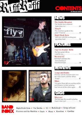
I had to make some slight changes from my plan during the process of putting my table of contents together:
1)I had to make the gaps in between the pages (Page numbers) larger as a magazine on average has at least 80 pages each issue therefore I made my page numbers larger by using 'Text box' and then changed the corresponding page number on my images to match their cover lines in the editorial pillar.
2) To make the title 'Riff Raff'' stand out as the publication logo i decided to have the title slant diagonally upwards from left to right in order to bring further attention to it as well as its grungy decorative font. I achieved this by using the 'Move tool' to reposition the title.
I was able to create the black rectangular boxes for the white font by using the 'Rectangular Marquee Tool' to create the rectangles and then filling them 'black' by using the 'Paint bucket tool'. To create the black frames i used the 'Custom shape tool' to create the rectangular frames choosing the option to not have a filled shape (outline) and making sure that my default colour choice was black. I used the 'Text box' tool for the text and numbers also using the 'Move tool' to position the text.
The images i had taken did not change from my plan and did not need to be edited as they were of an acceptable quality visually and also because conventially the images on the contents pages of most music magazines are not highly edited or to a high standard. Therefore i just used the 'Move tool' to position them and resize them to fit inside their frames using the 'Rectangular Marquee tool' to select the parts of the image that stuck out form under the frmaes and delete them by pressing the 'backspace button'.
No comments:
Post a Comment