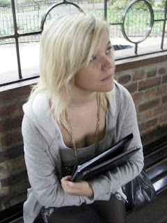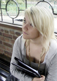

Before / After
After I uploaded my main image for my magazine cover onto the compurter I started to edit my image to make it more suitable for my magazine cover.
I needed to make sure my image was within the limits of size 'A4' for the magazine cover so I went to 'File' and opened a 'blank' new window adjusting its size to A4.
Before I could start to use the editting tools on photoshop I needed to copy the image by selecting it with 'Ctrl+B' then copying it with 'Ctrl+C' before pasting with 'Ctrl+V' onto the new opened A4 size photoshop window. However i noticed that my main image of the model was not giving a lot of space for the 'Right third' of which i was planning to place my coverlines to take advantage of the western eye flow. Therefore I flipped the image by while using the 'arrow' to resize the image i sized it back on itself causing the image to flip over. This put the side with more space on the 'left third' spacious enough for my planned layout for my coverlines.
After i fixed the size and spacwe problems I started to edit my image:
1) 'Enhance' -> 'auto layers' - so that Photoshop would automatically fix the layers so i don't have to worry about it.
2)'Enhance' -> 'auto contrast' - so that Photoshop would automatically fix the contrast so I don't need to worry about that.
3) 'Adjust lighting' -> 'Shadows/Highlights' - I adjusted the shadows to be darker and increased the mid tone slightly to make the lighting scheme more visually effective and clearer.
4) 'Hue/saturation' -. 'photo filter'- I adjusted the colour of the image giving it a slight black and greeny-yellow hue to make the location and model look visually more appealing fixing the quality of the skin tone.
5) 'Lighting levels' - i fixed the light levels enhancing the light level to a suitable amount as my photo had been taken outside but under the pavilion making it darker and shadowed. By increasing the light levels i made the image more clearer.
6)'Burn Tool' - i used the burn tool to darker my models eyelashes and eyebrows to make them stand out and to bring attention to her eyes and so the connotation that she is looking forward to the future in her academic path.
7) 'Dodge Tool' (right click the 'burn tool' and select 'dodge tool') - i used the 'Dodge tool' to lighten the school work in the folder to emphasise that it is a school magazine promoting and encouraging work and study.
I decide not to use the 'Spot healing tool' and use 'Gaussian blur' to fix her skin as her make up was good enough and i was trying to convey a sense of naturalness so i wanted to re frame from using too much photo shop techniques not wanting it to seem 'put on' or too 'fake' and 'superficial'.
The next step is to start introducing the 'Mast head', 'selling line', 'dateline', 'cover lines' and 'bar code' using the 'Text box' tool.
No comments:
Post a Comment