Wednesday 9 December 2009

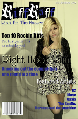
Riff Raff take 3


Although I made the appropiate changes to 'Riff Raff' draft 2 the cover was still missing something which i identified as a too simplistic or plain background.
Therefore i decided to experiment with the use of 'Brushes'.
To do this:
1) I first selected the 'brush tool'.
2) I then on the 'drop down list' selected the extension to 'load brushes'.
3) I then loaded the brushes from the appropiate folder in the U drive.
I experimented with the different 'brushes' such as:
'Assorted brushes'
'Basic brushes'
'Calligraphic brushes'
'Drop shadow brushes'
'Dry media brushes'
'Faux finish brushes'
'Natural brushes 2'
'Natural brushes'
'Pen pressure'
'Special effect brushes'
It was the last brush types that I found one that was most suitable for my magazine. The other brushes were either completely inappropiate or were more suited to the hip hop or drum and bass genre of magazine. The brush was of a rose which worked with my rock genre because of the popularity of the image in tattoos or in bands such as Guns and Roses. I changed the brush to black as a black rose challenging the expectations of the red rose of romance opposed to its now negative or darker connotations. I did this by adding a 'New layer' and placing the rose in the left third. I then used the 'rubber tool' to erase the part of the rose that was covering the main image of my model.

Friday 4 December 2009

Riff Raff take 2


The first draft of Riff Raff was not working effectively either to to with poor colour choice or missing conventions.

To tackle this:

1)The featured artists kicker colour was not effective and blended too much with the the background therefore I decided to change it to white by using the Painr bucket tool'.

2) I then decided to fill in the letters of the masthead blue and white alternately with the 'paint bucket tool' this is so i could tie in my colour scheme of black, blue and white.

3)I then added the missing dateline in white Flair roman with a black drop shadow.
I achieved this by duplicating the 'dateline layer' and putting it behind the first layer and retyping the dateline in black before finally using the 'move tool to achieve the drop shadow.

4) My first draft did not have a barcode therefore by using the search engine 'Google images' I searched for an image of a barcode to 'copy' and Edit -> 'paste' onto my magazine cover in Photo shop. I then used the 'move tool' to re size the image and place in the bottom left because of the excess space there.


Riff Raff cover take 1


Since I had edited the 'Main image' all i needed to do was to deal with the text of the cover. This included the 'Masthead', 'Strap line', 'Cover line', 'Main cover line' and 'Featured artists'.

For the Masthead I used a 'Black Casper' font in size 500 in black. I used bold blue Flair Roman for the strap line. I used black 'Impact' for the kicker of the cover line and a bold blue Flair Roman explanatory. I used bold black Flair Roman for the kicker of the main cover line and the explanatory in blue 'Impact'. I used bold 'Flair Roman'for the kicker of the featured artists in the same colour as the background by using the 'eyedropper tool' and blue 'impact' for the explanatory.
The diferences from my plan is the positioning of the featured artists to the right bottom of the cover to comply with the western eye flow and to make the text seem less like a list.
The 'a' of the 'raff'' was not the same kind of black casper font as the 'i' of the 'Riff'' therefore it offfset the symmetry that i was aiming for therefore i needed to change this. I achieved this by simplfying the masthead ('Simply layer') so it becomes like an image. Then i used the 'rubber tool' to rub out the 'a', (I also rubbed out the part of the masthead that was covering the model so it looks like the model is in front of the mast head following the conventions of successful music magazines). To make it symmetrical i needed to make an 'a' in the style of 'BLack Casper' font - first i used the 'shape tool' to make a rectangle and used the 'paint bucket tool' colour it black. Then i used the 'text box' to enter an 'a' that was the same as the 'i' within the black rectangle. I then used the 'eyedropper tool' and 'paint bucket tool' to change the 'a' ('Cloister black')into the same colour as the background( I then 'link layers'). Finally i used the 'move tool to resize and reposition so that the 'a' is slanted like the 'i' and in the masthead.

Photos taken and edited part 4

For this photo I wanted to convey the true rock spirit of rebellion and attitude therefore i asked my model to give an offensive gesture to the camera. This sentiment is supported by the models costume- the leopard print dress bears connotations of wildness and the leather jacket is often associated with the rock culture a an icon of a disregard for rules and morals.
1) 'Crop' - i decided to crop the right side of the photo so that I could get rid of the door handle.
2)'Enhance -> auto levels' - the program automatically corrects average issues of the level of contast/lightness and tonal so I don't need to worry about it.
3) 'Enhance -> auto contrast'- the program automatically fixes the contrast levels so i don't need to worry about it.
4) 'Enhance -> Adjust lighting -> shadow/highlights'- I slightly increased the light and the dark tones to make the the image more clearer with better lighting/tones.
5) 'Adjustment layer (hue/saturation)-> photo filter x3- I adjusted the colour of the image giving it slight orange, black and yellow/green hues to make the location and the model look visually more appealing fixing the quality of the skin tone giving it an overexposed look.
6) 'Burn tool' - I used the tool to darken the models eyelashes and eyeliner to bring attention to her eyes emphasising her challenging/questioning stare. I darkened the models roots to support the overexposed effect.
7) 'Blur tool' - I used the tool to smooth out the models skin to fix any blemishes or textures that were an issue.

Photos taken and edited part 3


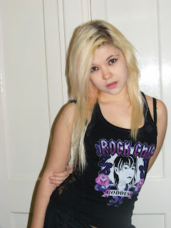
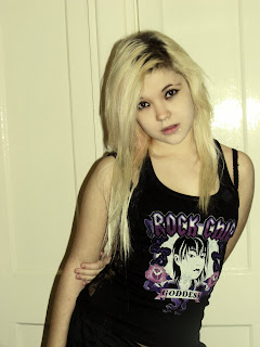
For this photo I decided to try a very obvious rock feel shown by the mock innocent pose and vest top that literally spells it out to the reader that she is a rock model. However I found the pose and the costume to be too obvious and therefore very amateur and low quality therefore I will not be using this photo.
1) 'Enhance -> auto levels' - the program automatically corrects average issues of the level of contast/lightness and tonal so I don't need to worry about it.
2) 'Enhance -> auto contrast'- the program automatically fixes the contrast levels so i don't need to worry about it.
3) 'Enhance -> Adjust lighting -> shadow/highlights'- I slightly increased the light and the dark tones to make the the image more clearer with better lighting/tones.
4) 'Adjustment layer (hue/saturation)-> photo filter x3- I adjusted the colour of the image giving it slight orange, black and yellow/green hues to make the location and the model look visually more appealing fixing the quality of the skin tone giving it an overexposed look.
5) 'Burn tool' - I used the tool to darken the models eyelashes and eyeliner to bring attention to her eyes emphasising her challenging/questioning stare. I darkened the models roots to support the overexposed effect.
6) 'Blur tool' - I used the tool to smooth out the models skin to fix any blemishes or textures that were an issue.

Photos taken and edited part 2


For this photo I wanted a more bolder obvious rock pose.This is shown through the models informal stance which suggests a lack of concern for rules and conventions supported by her casual costume.


After I taken the photo I needed to edit it:


1)'Enhance -> auto levels' - the program automatically corrects average issues of the level of contast/lightness and tonal so I don't need to worry about it.
2) 'Enhance -> auto contrast'- the program automatically fixes the contrast levels so i don't need to worry about it.
3) 'Enhance -> Adjust lighting -> shadow/highlights'- I slightly increased the light and the dark tones to make the the image more clearer with better lighting/tones.
4) 'Adjustment layer (hue/saturation)-> photo filter x3- I adjusted the colour of the image giving it slight orange, black and yellow/green hues to make the location and the model look visually more appealing fixing the quality of the skin tone giving it an overexposed look.
5) 'Burn tool' - I used the tool to darken the models eyelashes and eyeliner to bring attention to her eyes emphasising her challenging/questioning stare. I darkened the models roots to support the overexposed effect.
6) 'Blur tool' - I used the tool to smooth out the models skin to fix any blemishes or textures that were an issue.

Photos taken and edited part 1


In the first photo I took I decided that i wanted a simple pose so I didn't want any props - I wanted to focus on the direct challenging gaze associated with rock magazine conventions.

The gaze is direct which could be interpreted as a challenge to the reader or a sign of confidence or even arrogance similar to the attitude most rock models adopt especially with the model leaning her head to the left side (rule of left third helps point to the left third and therefore the all important text), which is a questioning pose/body language. I asked the model to have her first costume casual in order to convey that the model isn't concerned about what other people think about her. The location/background is a white doorway which i hoped would naturally frame the model and have few connotations so the reader is not distracted.

After I had taken the photo I needed to edit it:

1)'Enhance -> auto levels' - the program automatically corrects average issues of the level of contast/lightness and tonal so I don't need to worry about it.

2) 'Enhance -> auto contrast'- the program automatically fixes the contrast levels so i don't need to worry about it.

3) 'Enhance -> Adjust lighting -> shadow/highlights'- I slightly increased the light and the dark tones to make the the image more clearer with better lighting/tones.

4) 'Adjustment layer (hue/saturation)-> photo filter x3- I adjusted the colour of the image giving it slight orange, black and yellow/green hues to make the location and the model look visually more appealing fixing the quality of the skin tone giving it an overexposed look.

5) 'Burn tool' - I used the tool to darken the models eyelashes and eyeliner to bring attention to her eyes emphasising her challenging/questioning stare. I darkened the models roots to support the overexposed effect.

6) 'Blur tool' - I used the tool to smooth out the models skin to fix any blemishes or textures that were an issue.

Wednesday 2 December 2009

Main image photoshoot plan

After I had completed the Magazine mock up cover I needed to then start to plan a Photo shoot for my main image. I planned to have the model pose with a guitar and without a guitar in several 'rock style' poses to see which one was most effective or suited to my magazine. To do this I also had the model have several costume changes so that I could see which was most suited to the 'rock look' I was aiming to achieve.

Monday 30 November 2009

Magazine Mock Up

Before I can start to make my music magazine cover I needed to plan the layout first so that I could use the conventions of a music magazine cover to it's full affect for my own magazine. This included where to place the masthead, strap line, date line, cover line, main cover line, main image and featured artists and what should each one include.

Tuesday 24 November 2009

Music magazine cover analysis

Before I start to plan my own Music magazine cover I needed to study over music magazine covers to learn more about it's conventions and what were the most effective techniques that I could then use in my own Music magazine cover.

Monday 23 November 2009

Rock the mood


Informed by my questionnaires i started to research things that would make up the most popular genre of 'Rock music'. My magazine will feature many artists from the different sub cultures of rock such as U2 for 'New wave', Muse for 'Alternative rock', Oasis for 'Britpop', Indie rock and sex pistols for 'punk'. This would appeal to a wide range of rock music fans giving a diverse spectrum of music news. I also collected images that would reflect the mood and the type of features which will be included in my magazine. I included an image of fans at a music festival to show that my magazine will include information about new music and reviews. I also included images that were symbollic of rock music such as the electric guitar, tattoo art and badge to give it a conventional rock music feel.

Friday 20 November 2009

Questionaire charts

After I had typed up the results onto 'Microsoft Excel' in spreadsheet format I then needed to put this data into a chart format in order to effectively and clearly show my results.

To do this I first highlighted the relevant data, (holding down the left button on the mouse).
2) I selected 'Insert' on the task bar --> selected 'charts'.
3) For the first three i decided to use diferent coloured pie charts which i selected from the taskbar.
4) For the last three I decided to use different coloured 'do0nut' charts which I selected from the task bar to display my results.
The charts show the results in persentages of the 20 people who completed the survey girls and boys.

Thursday 19 November 2009

Questionaire results excel

After I had finished carrying out my survey I tallied up the results of the key questions of the Questionaire and entered them into 'Microsoft Excel' in order to display my results and so that I would be able to make Charts of the results using the program.

Wednesday 11 November 2009

Music magazine Questionnaire

Before I started my Music magzine cover I needed to collect research and mass opinion about music magazine features, music and Fonts so that I could have a good foundation of research before intial design to see what would be popular and effective.

Media Project Plan

Before starting my Music magazine Project I needed to plan out the tasks of the project so that I could organise the tasks effectively and efficiently.

Monday 9 November 2009

'Sixth Sense' contents page


After i had added the church image to the background which i had to do several times changing the image to make it faded enough as it kept interfering with the readers attention. The background image really brought everything together and complete.

I also changed the explanatory to start with capitals to make it look more grammatically correct and professional and softened the edges of the images with the 'blur tool' so that they did not seem to harsh and a part of the page. To make sure that the purple of my contents page matched the shade from the cover page I used the 'Eyedropper tool' to select the correct shade from the text of my cover page and use the 'paint bucket tool' to fill in the text of the contents page so that the two pages match and tie in with each other.

background


Since my contents page seemed too bare and simplistic i decided to put a image in the background to fix this problem. I decided to use the iconic image of the st marylebone church spire as the background to tie in with the school magazine form. However the image I chose needed to be edited otherwise it could crowd the page and draw attention or make it harder to see the text. Also the image did not fit with my colour scheme.


I used Photoshop to at first to change the 'hue/saturation' which turned the blue sky purple which fitted in with my colour scheme of my magazine and the golden angel statues green which tied in with st marylebone school or any church faith or old colledge because of the obscurity of the image and its connotations of academic aspiration besides spiritual or otherwise.


Although I had fixed the colour scheme it was still too bright so I changed the 'adjust lighting' to make the image faint enough to put behind my Contents page.

Contents page


Using my plan I began to form my Contents page including the colour scheme, Font (type, size and colour), page numbers, editorial pillars, kickers and explanatory and images. The 'Contents' although it was purple on black it still needed a white backdrop to bring special emphasis on the title. After I had stuck to the details of my plan I found that there was too much blank space making my contents page look very simplistic and amateur therefore I needed to fill this space with colour or an image.

Font: 'Impact' for title and page numbers and editorial pillars.

'Times New Roman' for kickers and explanatory.

Friday 6 November 2009

Sixth Form Survival Guide image edited.


Firstly I needed to bring attention to my models so therefore i added another layer and used 'Gausian Blur' this meant that all the image was now blurred. Using the 'Rubber tool' i erased the blur on my models and what they were reading so that now the immediate foreground and background were now the only things blurred. This was a minor change but it made a significant difference to the image. Like in the letters image i needed to include a page number in the left bottom corner in the same font and colour and like in the letters image in font size 300. I decided to also use a black 'backdrop' on the page number to tie in with the first image.

Letters image edited


Firstly I needed to make the image stand out more as the photo was quite dark despite the natural light and seems unfocused . Although the photo was slightly blurry this was not a problem as the photo would not be very big on the table of contents and so this would not be noticed. But i still needed to make it lighter and stand out more so i used the 'hue/saturation' tool to bring out the light brown and white of the letters.
I also needed to include a page number in the left bottom corner so i used 'Impact' font in white as i had planned but found that it blended with the white letter in the same corner. To fix this i put a black 'back drop' (shadow), behind the number to make it clearer.
The pile of letters connotate that a lot of letters are being held back by the postal strike and this is a problem- that will be addressed in the magazine.

Photoshoot plan for table of contents.

For my 'Contents page' I needed to arrange and plan the two photos i needed for my images on my contents page that go with the main stories. I needed to decide what type of camera shot/angle i needed, location, lighting, model/props and connotation and denotations.
However once i had arranged the time and place for the photoshoots i found at that time I had to change my plans. Instead of one model for the 'Sixth Form Survival ' story i decided that there should be two to show that many people do indeed struggle during A level.

Wednesday 4 November 2009

Unedited photos for the contents page


After i had finished the photo shoot plan for my contents page images I collected the props i needed such as the letters and the folders and books in order to carry out my plans.


I used the rooms lighting in both photos as i wanted my images to seem natural rather than meticulously planned like i had done with the main image of my magazine cover.


At home i collected envelopes and two school letters and arranged them on a pile on the floor to illustrate the postal strike story that school letters are being held up. They were too big to use macro and if i used flash it would over expose the image so i used a plain photo type. I used a aerial shot on the photos to convey how the letters are being backed up in the post office in vast piles.


At school at lunchtime i had arranged for two of my friends to model for my Sixth Form Survival Guide story showing two students with a vast amount of work in front of them which they are being overwhelmed by shown by the vast amount of folders in the foreground and the defeatist attitude of Laura's pose showing that A levels can be daunting and many people struggle with the work load. This would appeal to most students at sixth form especially those who are finding it the hardest to adjust between the jump from GCSE to A level. Again i used the room lighting and no flash for the same reasons as the letters photo but this time i used a level mid shot to put emphasis on the models 'frustration' through their expressions and their postures and to make the work in front of them look more daunting as you cannot see the end of it.

Saturday 24 October 2009

Contents page plan


After I had finished the planning and editing of my magazine cover I needed to to start making a plan of my contents page. I needed to include the editorial pillars of my magazine which were 'NEWS', 'STUDY', 'LIFE' and 'YOUR SAY'. Under the editorial pillars I needed to put my cover lines and add two more features that would be in this issue but not mentioned on the cover( 'Do You Need Relief From Stress', 'Your Letters' and Q and A'). Just like a conventional magazine I included the page numbers so the reader knows which page they need to turn to for a particular cover line story and included pictures to further help illustrate what the stories are about visually.

The title 'CONTENTS' will be in a Sans Serif font - 'Impact' like some of my coverlines of my magazine cover to tie the two together along with the Masthead on the cover.


EDITORIAL PILLARS will also be in 'Impact' and purple but smaller than the title but larger than the features.


STORIES will be in Kicker and Explanatory form in black 'Times New Roman'.


TWO IMAGES showing and putting emphasis on the main cover line/stories to give the reader a sense of what they are about. I will have a image of st marylebone letters to illustrate the feature on the postal strike showing how the post is getting backlogged and key letters and information may not be getting through. The other image will be of two students studying with one looking like she is struggling with work to show the issue the feature of the Sixth Form Survival Guide will address - the target audience of sixth form students will identify with this scene as they too may feel like they are struggling with A level work and may want to read about how thay could improve.

PAGE NUMBERS will be in the left bottom corner in white on the images to illustrate where you can find the main features. ('Impact' but larger Font size than the page numbers)


ELLIPSIES - I will use ellipsies from the last kicker or explanatory of a editorial pillar to guide the readers eye line to the page number.

Friday 16 October 2009

Second Draft


After receiving feedback and evaluating my magazine i found that I needed to start making a few changes to 'Sixth Sense' for improvement.


The Changes:


  1. The 'REVISION TIME' kicker was not clear enough so I needed to put a black shadow behind to make it stand out.


  2. The main cover line kicker 'Sixth Form Survival' was cutting across the bottom too much so I repositioned the main Cover line to fix this.


  3. I needed to add or change a cover line with direct address so as to connect more personally to the target audience of 16 - 18 year olds. Therefore I changed my second cover line to use direct address. I didn't add another cover line as suggested as I felt that if I put another cover line on the cover it would crowd the space and make the cover too busy and distracting.

Feedback and Evaluation

After completing my first draft of 'Sixth Sense' I needed to see how effective I had been so I needed to collect feedback from my target audience (Sixth form students), in order to see where i had employed the techniques well and where the areas of improvement were in order to make changes later in my second draft. I also evaluated my magazine to analyse myself whether I've been using the correct conventions or whether i could revise my approach to editing 'Sixth Sense'.

Thursday 15 October 2009

First Draft of my magazine - 'Sixth Sense'


After following my plan I found I had to make some slight changes such as putting a black shadow behind my explanatory text for my Postal strike cover line and a white shadow behind the Date line. This is so that it wouldn't blend in with the image as it was doing making illegible to the reader. I also had to reposition the layout of my cover lines so that it wouldn't interfere with my main image and so that it would conform to the rule of thirds. The fonts i decided to use whilst editing is 'Impact for my two cover line kickers with 'Ariel' explanatory. Impact is thicker than Ariel so it easy to distinguish. I decided to use the decrotive font of 'Birth of a hero' font so that it will stand out and relates visually to its topic of my main coverline. I used the impact font as explanatory as it neexded to be thick so it wouldn't be over powered by the decrotive font.

After this first draft i will need to evaluate and recieve feedback in order to see what needs to be improved.

Magazine Plan

My magazine plan:

Friday 9 October 2009

My school magazine: Editing my main image.


Before / After


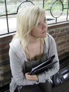
After I uploaded my main image for my magazine cover onto the compurter I started to edit my image to make it more suitable for my magazine cover.

I needed to make sure my image was within the limits of size 'A4' for the magazine cover so I went to 'File' and opened a 'blank' new window adjusting its size to A4.

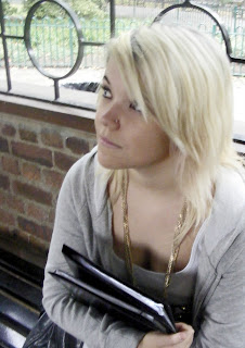
Before I could start to use the editting tools on photoshop I needed to copy the image by selecting it with 'Ctrl+B' then copying it with 'Ctrl+C' before pasting with 'Ctrl+V' onto the new opened A4 size photoshop window. However i noticed that my main image of the model was not giving a lot of space for the 'Right third' of which i was planning to place my coverlines to take advantage of the western eye flow. Therefore I flipped the image by while using the 'arrow' to resize the image i sized it back on itself causing the image to flip over. This put the side with more space on the 'left third' spacious enough for my planned layout for my coverlines.


After i fixed the size and spacwe problems I started to edit my image:


1) 'Enhance' -> 'auto layers' - so that Photoshop would automatically fix the layers so i don't have to worry about it.


2)'Enhance' -> 'auto contrast' - so that Photoshop would automatically fix the contrast so I don't need to worry about that.


3) 'Adjust lighting' -> 'Shadows/Highlights' - I adjusted the shadows to be darker and increased the mid tone slightly to make the lighting scheme more visually effective and clearer.


4) 'Hue/saturation' -. 'photo filter'- I adjusted the colour of the image giving it a slight black and greeny-yellow hue to make the location and model look visually more appealing fixing the quality of the skin tone.


5) 'Lighting levels' - i fixed the light levels enhancing the light level to a suitable amount as my photo had been taken outside but under the pavilion making it darker and shadowed. By increasing the light levels i made the image more clearer.


6)'Burn Tool' - i used the burn tool to darker my models eyelashes and eyebrows to make them stand out and to bring attention to her eyes and so the connotation that she is looking forward to the future in her academic path.


7) 'Dodge Tool' (right click the 'burn tool' and select 'dodge tool') - i used the 'Dodge tool' to lighten the school work in the folder to emphasise that it is a school magazine promoting and encouraging work and study.


I decide not to use the 'Spot healing tool' and use 'Gaussian blur' to fix her skin as her make up was good enough and i was trying to convey a sense of naturalness so i wanted to re frame from using too much photo shop techniques not wanting it to seem 'put on' or too 'fake' and 'superficial'.


The next step is to start introducing the 'Mast head', 'selling line', 'dateline', 'cover lines' and 'bar code' using the 'Text box' tool.

School Magazine Photo Shoot.


After learning and developing skills of media with photoshop and then techniques of a successful magazine cover we were to then make our own school magazine cover. We were to arrange a time and place to take pictures of a volunteer model to serve as our main image. I arranged for my friend who is in the same class as me to go out during a media lesson and take pictures outside in the st marylebone gardens behind blandford street. I had my friend sit in the pavilion with a folder looking away from the camera. I asked her to do this as I wanted to illustrate my desired connotations of a unrestrictive learning environment and attitude shown by her location and her props of folders full of classwork. I had my friend look away from camera and focus on a point in the distance as i wanted to convey a sense of focus on students academic path in life - an aspiration to do well in the future.

Wednesday 7 October 2009

School magazine comparison

We were told to pick two school magazine covers and compare the techniques each used to see which one was more effective. I chose to compare 'COLEDGE' magazine and 'My Colledge' magazine:


COLLEDGE MAGAZINE:
Keeps with the rule of thirds by having the main image of the student centred and in medium shot leaving space for the cover lines and anchoring in the reader’s eye line naturally.
The text is mainly in A Sans Serif Font so that the mast head and cover lines stand out and make it more memorable and recognisable. However it does have a small amount of decorative font compatible with the theme of that cover line feature (Greek letters for the cover line about Greek families). This is to add special emphasis on that cover line.
It also possesses a selling line and a date of issue under the masthead giving it a professional appeal and impression that it is a weekly entity for its college.


MY COLLEDGE MAGAZINE:
This magazine is different as it breaks the rule of thirds by having the model lying down across the bottom and the text mainly centred breaking up the desired anchoring effect for the eyes natural path. The masthead and the cover lines are typed in A Serif Font usually used for long body of texts. Compared with the first magazine it is not as visually effective or memorable as the eye line is not as flowing and the absence of a selling line, date line and barcode suggests that maybe the people in charge of this magazine is not necessarily professional or experienced enough.

Labelling magazine covers


Our second lesson was to learn about the structure of a magazine cover including the names of the techniques used and the names of the fonts and why they are used. I decided to study the music magazine 'Q Magazine'. I chose this magazine as it is a well known music magazine - one of the best selling music magazines in the British market. I learnt about the the effects of placing the 'coverlines' down the left third (to anchor the natural eye flow of an individual from the western culture). I learnt that the 'Masthead' is the title of the magazine which is normally accompanied by the 'Selling line' and the 'dateline'. I also learnt about the types of different fonts and thier impacts on the reader. Sans Serif Font stands out, Serif font is good for 'Main body text' and 'Decorative Font' is useful for adding special emphasis on a headline.

This was all to help us see the technicalities of creating a magazine cover which will be useful in later work.

Tuesday 6 October 2009

The begining of media - photoshop editting


Before and After

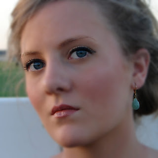
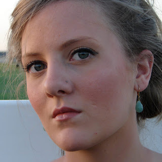
At the start of our media A level we were given a lesson into how to edit an image to improve or to edit it to make it appropiate for its given purpose. We were taught how to use Photoshop on a model of a person. 1) First step I did was to create a new layer. 2) I was taught how to use the 'Spot healing tool' to easily edit out any skin blemishes like spots and a nose piercing. 3) I was then taught how to smooth the models skin by using 'Gaussian Blur' (changing the pixels until I found a suitable amount). 4) After I used the 'Rubber tool' to rub the blur off the areas that didn't need to be blurred such as the eyes, eyebrows, lips and her earring. 5) I had to make a new layer for editing the colour of the models eyes(LAYER 2). 6)I had to select the 'Brush tool' making sure that its pixel size matched the size of the models irises. 7) I then needed to choose a colour from the 'palette' that would be the colour i would change the irises to - i chose a bright blue (the models original eye colour was green). 8) After I had chosen i used the 'Brush tool' to go over the models irises. 9) This covered the irises with big blue circles so i needed to use 'Soft light' and change the opacity down to about 40% to make the new eye colour more realistic and not look like just a big blue blob over the irises.